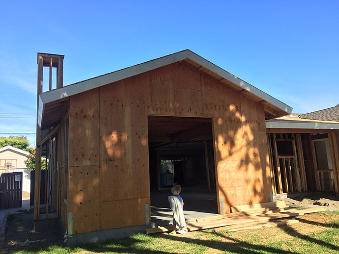
At this stage in the remodel we needed to have the shower and bath valves ready for the plumbing crew. I’m learning a lot through this process and so when our contractor said he needed our valves, he didn’t even mean he needed the entire tub and faucet handles, but just the back-end of the plumbing fixtures. Because they’re all different though, we still needed to get the overall design of the bathrooms (and subsequently the kitchen too) squared away so we could order the right valves that went with our faucets and shower heads. Make sense? Don’t worry if it doesn’t, minor details anyhow 😉
So when it comes to “designing” a kitchen and a couple of bathrooms from scratch, my fear of screwing it all up is way more prominent of an emotion than actual excitement. I had dreaded the moment that we would have to start getting down to picking finishes just because I didn’t want to choose wrong and I knew I’d get overwhelmed with it all. Sure I have specific tastes and wants/needs, but when I see a room I like on Pinterest, I don’t feel very sure of being able to design and execute the design in a way I’d love enough to live with for the next 20-30 years. I guess you could say I don’t lack confidence in my taste preferences, but I do lack confidence in my ability to execute my taste preferences. That, combined with the idea of running around to different stores to pick out tile and fixtures, just doesn’t sound all that fun to me. Maybe I’m in the minority here.
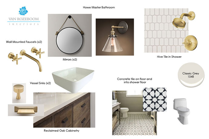
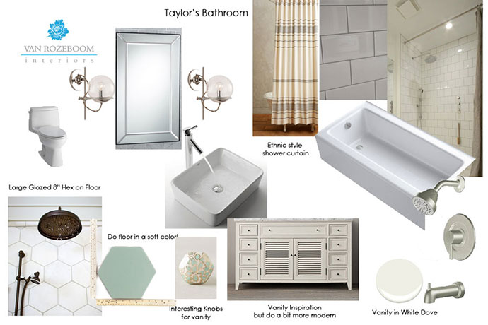
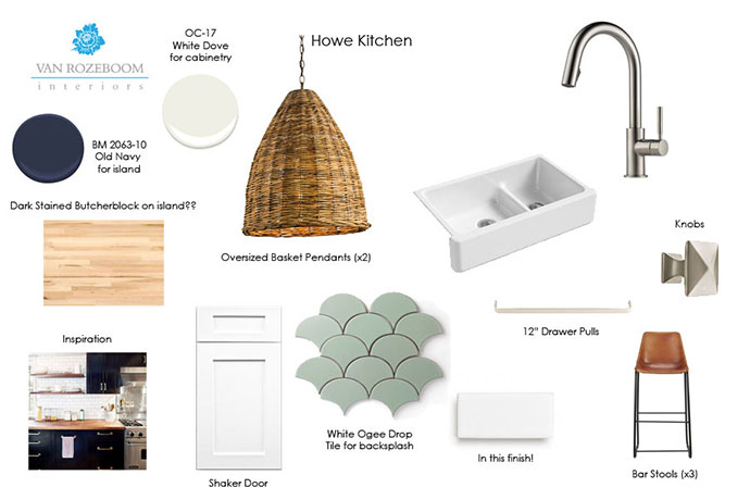
In the end, I decided to have my friend Shelly of Van Rozeboom Interiors help me out and steer me in a clearer design direction. I sort of have varied tastes, and while I definitely have strong opinions on what I like and don’t like, I knew I could trust her design aesthetic to get us to a place we’d be happy with, otherwise I was afraid I’d end up designing a house that was all over the place. Because she’s recently moved, she’s doing e-design for us, which is an affordable option for those who just need a little hand-holding through the design process. I wasn’t looking for someone to take me around and spend hours shopping with me, or even show up at the house and oversee product installs. I just needed someone to narrow down what seems to be endless options, and so far I’m so happy we made the decision to go this route. With e-design she basically creates a story board for inspiration and then helps us pick out all the fixtures, tile, counter-tops, lighting and other necessary accessories. Because we’re friends she’s a bit more flexible with how she helps us out, but for the most part I believe she provides a client with a story board and then provides a couple of different options in each category to choose from. She typically gathers info from a client questionnaire, and looks at your Pinterest board. Just from our conversations, knowing me personally and looking at my Pinterest boards, she gathered that I was going for a modern day Santa Barbara Spanish style design aesthetic. Sounds great to me! Here’s where we’re at so far.
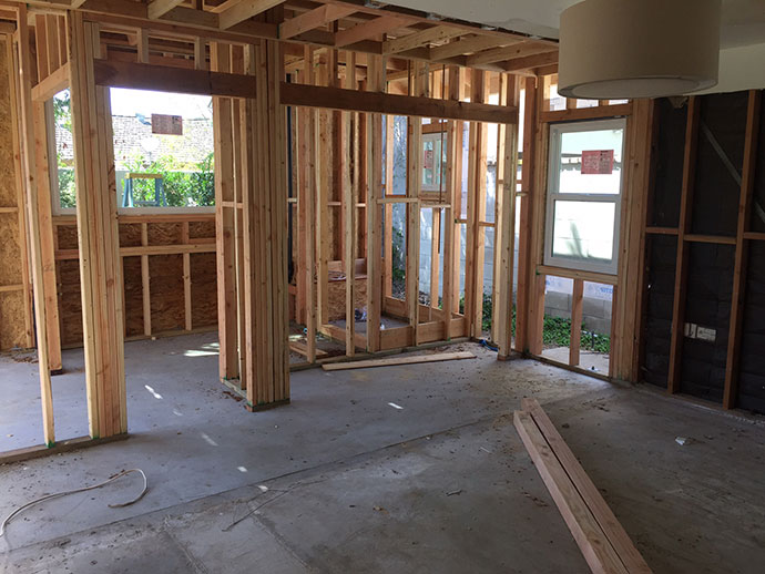
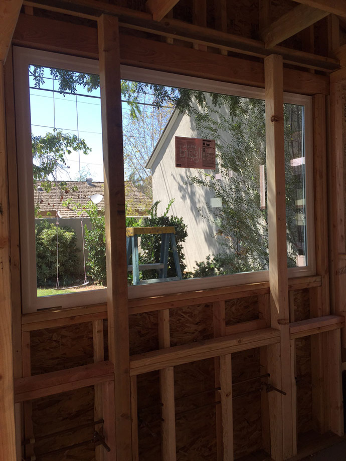
And the photo above is the one design risk we did take with the remodel. Using this bathroom as design inspiration, we went with a huge picture window that overlooks the backyard. The posts will be wrapped/stained to match the cabinetry, and the mirrors will hang right on the posts. We will install a very sleek linen shade up top that can roll down for privacy, but otherwise we will keep it open to let in light most of the time. I’m excited and nervous to see how it all comes out.
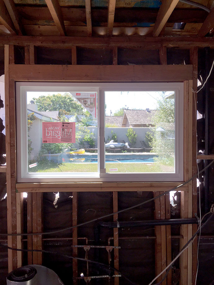
The photo below is of my new and improved kitchen window, which measures close to 5 glorious feet and opens up nice and wide to let in lots of fresh air. Our old window was a small garden box which had 2 teeny tiny vented side windows that let in no air. I’m really so excited about this new window above the sink and can see myself happily doing dishes here for years to come.
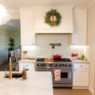
While the design of the kitchen is of course important, the main beef of the room revolves all around the appliances. Shelly answered some general questions for us, but really in the end choosing the right appliances for our needs and budget was really left up to us. We have decided to go with a Thermador 6 burner counter-top range, a Bosch double oven, dishwasher and microwave, and a Samsung fridge. This past weekend I went to 3 different stores and spent lots of time researching online and scouring Consumer Reports. While I initially went in thinking we’d go for a Thermador package (buy a range and oven and get a dishwasher free), when push came to shove it just didn’t make financial sense, and we really wanted to stick with our budget. We’ve quickly found out that going over budget here and there quickly adds up, and with appliances things could easily get out of control. Bosch makes a great product that rates well and is very affordable compared with the other high-end appliances. Plus, Thermador now owns Bosch, and I would have went with Bosch for all the appliances but they don’t make a 6 burner range top, just a countertop stove.
Believe it or not, choosing the fridge took the most time. We originally designed a built-in fridge for the kitchen, but when we learned that built-ins start at $7,000 and don’t really give you all that much extra storage space, we scrapped that idea. Instead, we decided to go with a counter-depth fridge to get the same sort of look as a built-in but at a fraction of the cost. Yes, you sacrifice some storage space (about 5 cubic feet depending on the model), I figure a smaller fridge just helps me keep things more organized in there. I routinely clean out our fridge every week, so a little less storage shouldn’t be that big of an issue. Plus, we do have a back-up fridge in the garage. Bosch makes a nice counter-depth fridge, but in the end we went with Samsung because it had a couple of extra cubic feet as well as some extra features we were looking for, and was very energy efficient, so much so that SCE is giving us a $75 rebate!
Now that we’ve got the design thing figured out and we’ve chosen the appliances, I’m getting really really excited and very anxious for this to be done! I can’t wait to move past this bare-bones look and start seeing some more progress, like insulation and drywall hehe 🙂 Thanks for your patience while we adjust to a new living situation and I find it a bit more challenging to share in this space. I can’t wait to be back and settled in and return to more regular posts here. Talk soon and keep in touch on IG!


Lillian Schaeffer says
Thanks for sharing! I love your point that a lot of your kitchen revolves around the appliances. My husband and I are going to be doing some renovations to ours, and we want to change the design and upgrade some things. We’ll definitely put a lot of thought into the appliances because they’re such a huge part of the functionality of the kitchen.
the Blah Blah Blahger says
I spent way too much brain power on appliances…glad you got yours chosen!
Alyssa from The Sparkly Life says
so exciting! loved getting a glimpse at everything. it all looks like it’s going to be so gorgeous. can’t wait to see the final results!