Hello and good morning! So last year, the house was on Apartment Therapy which was really cool, but I felt funny talking about it much. To this day I still haven’t read the comments on the post, but I hear some people were confused that we only had 2 bedrooms in a 2200 square foot house. We do in fact have 4 bedrooms, but at the time of the shoot, only 2 of them were “AT worthy” so to speak. Turns out that remodeling a house is an undertaking in time and resources you’re never quite prepared for, and surprise, surprise, the project always goes over budget and takes long than expected.
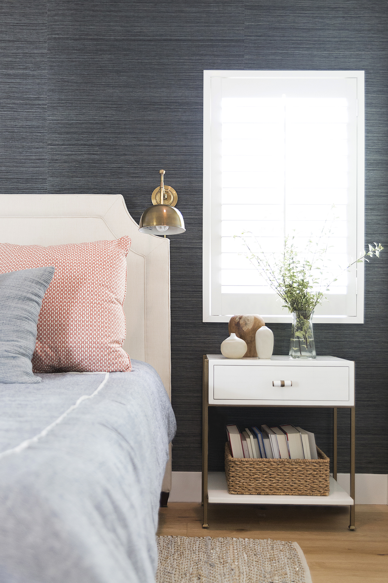
So two years later, we still find ourselves putting the “finishing touches” on the house. All is well though and I’m glad that for the most part, I didn’t rush in to decorating/design decisions. I’m pretty happy (thrilled) with how everything came out and feel extremely grateful for our lovely home. Shall I share with you pictures of the master bedroom/bath, and Taylor’s bedroom & bathroom? We’ll start in the master. I wanted some color, but also wanted it to feel masculine, hence the black grasscloth wallpaper. This was previously Hayden’s nursery, and before we knew we were going to have a 3rd child, it was the guest room/office. This space has gone through quite the transformation over the years, and is now finally our “master quarters” haha! We popped the room out about 4 more feet, then added the bathroom.
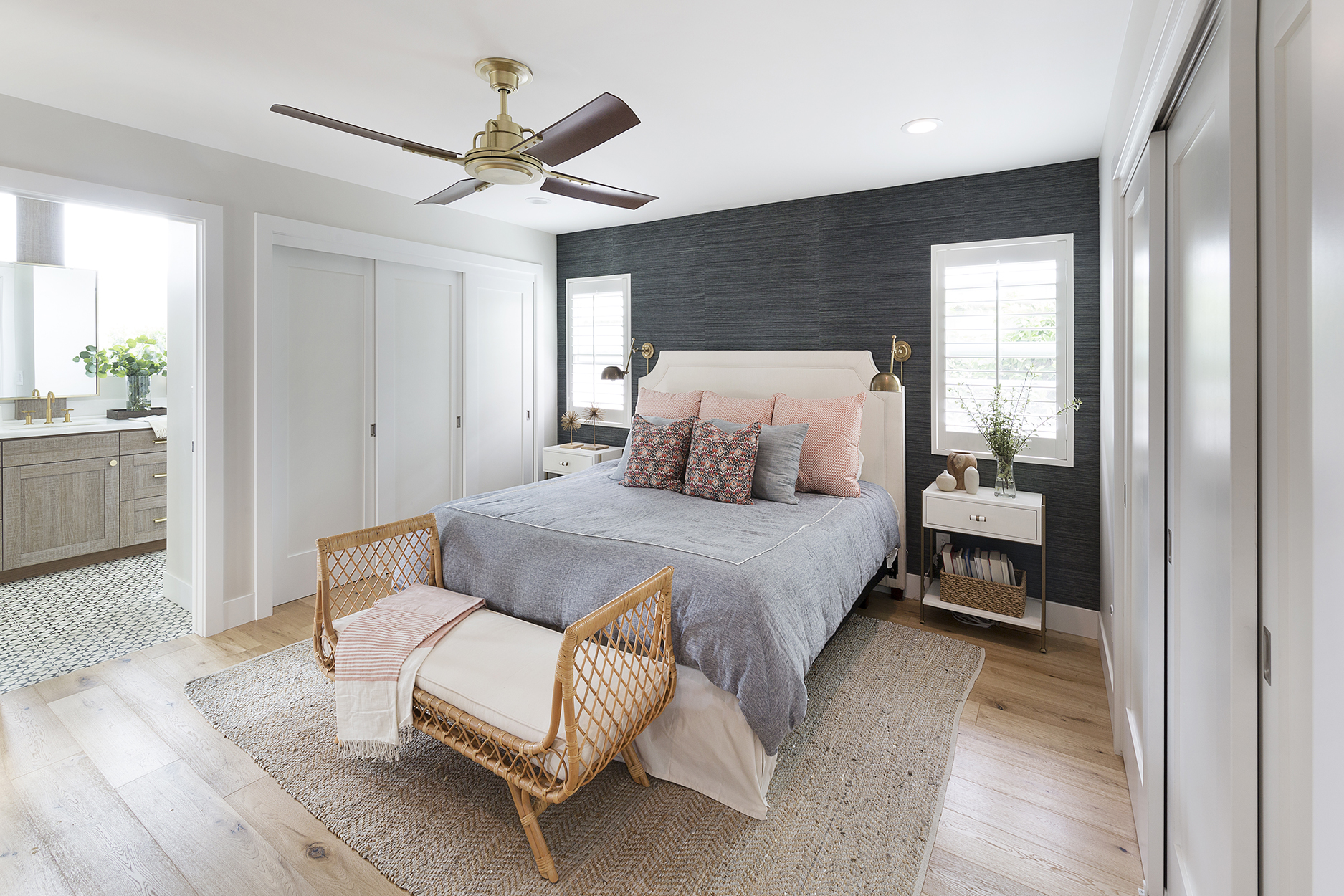
We were both adamant that the addition not swallow up too much space in the backyard, so we ditched the usual walk-in closet/full bath that most master suites have, and kept it somewhat simple. To allow for more closet space, we added his & her double wall closets on either side of the room, which gives us both more closet space and also solves the pesky design problem of finding stuff to hang on the wall. So far we both really enjoy this set-up and find it very useful. Sure, a walk-in closet would be nice, but it really is just a luxury and I’m glad we didn’t sacrifice the backyard for one. Our designer/stylist for the project brought in this cute Serena & Lily knockoff bench and I love it, although truth be told it doesn’t feel super sturdy. Art and I can’t sit on it at the same time because it creaks and moans when we do haha! The rug was pulled in from the living room and is Serena & Lily. Our old dog Maddie loved sleeping on one corner of it, and she left a dark stain on it from the oils of her fur, which is now conveniently hidden under the bed. Whenever we want a reminder of our faithful old girl, we just lift up the bed skirt and take a peek at her sleeping circle.
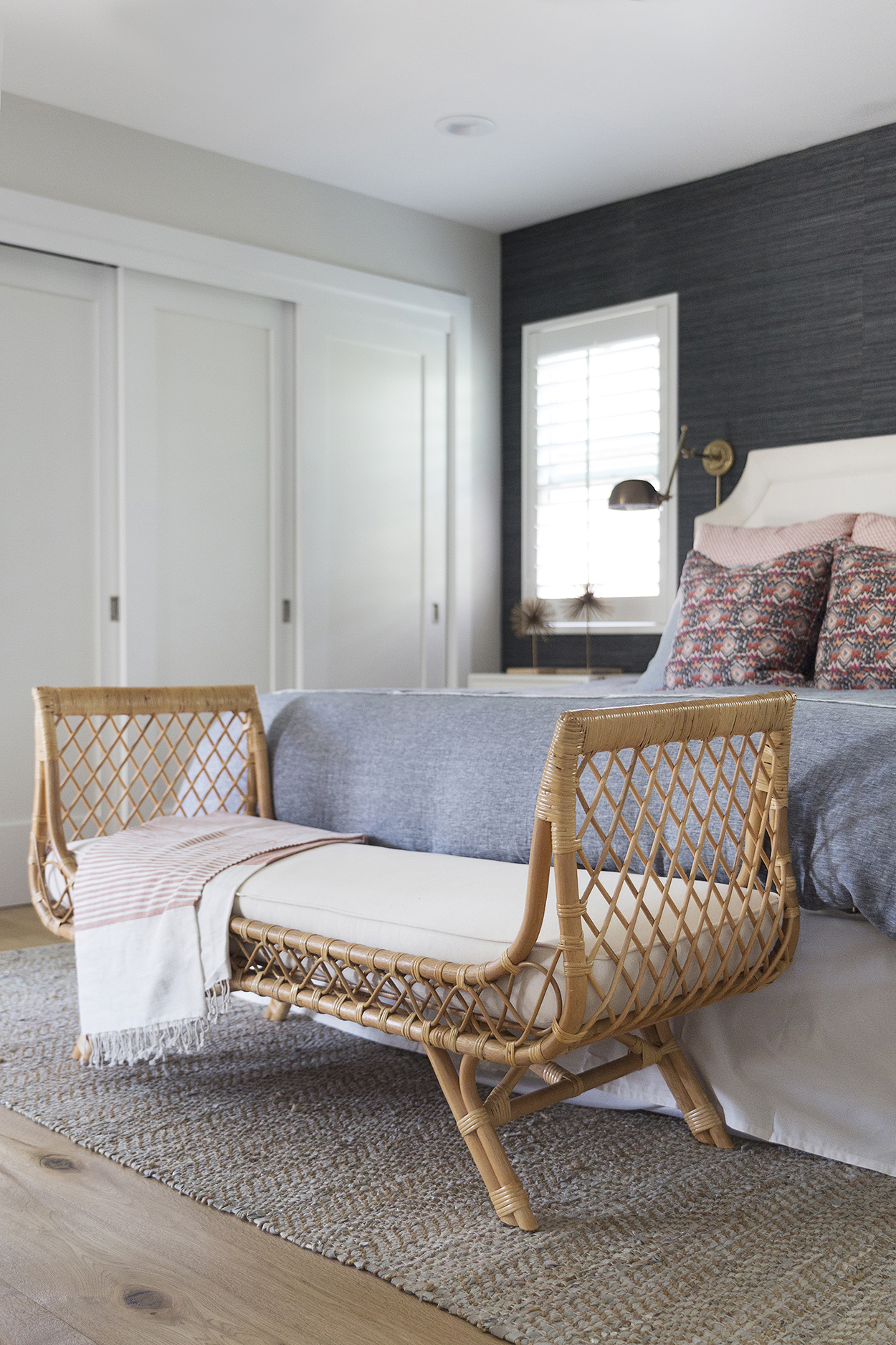
The headboard is and task lights are from Pottery Barn, and the nightstands and bedding are from our local furniture store Chartreuse. The knick-knacks are from various places and Art’s nightstand definitely doesn’t look like this every day.
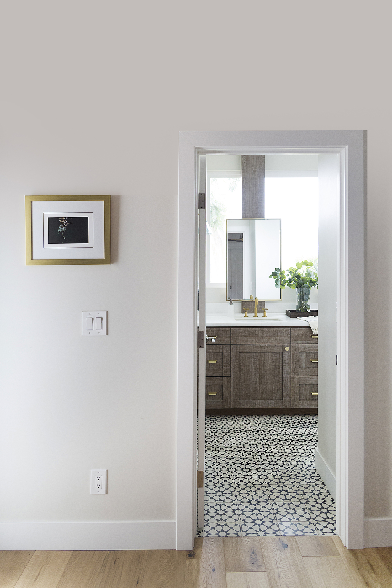
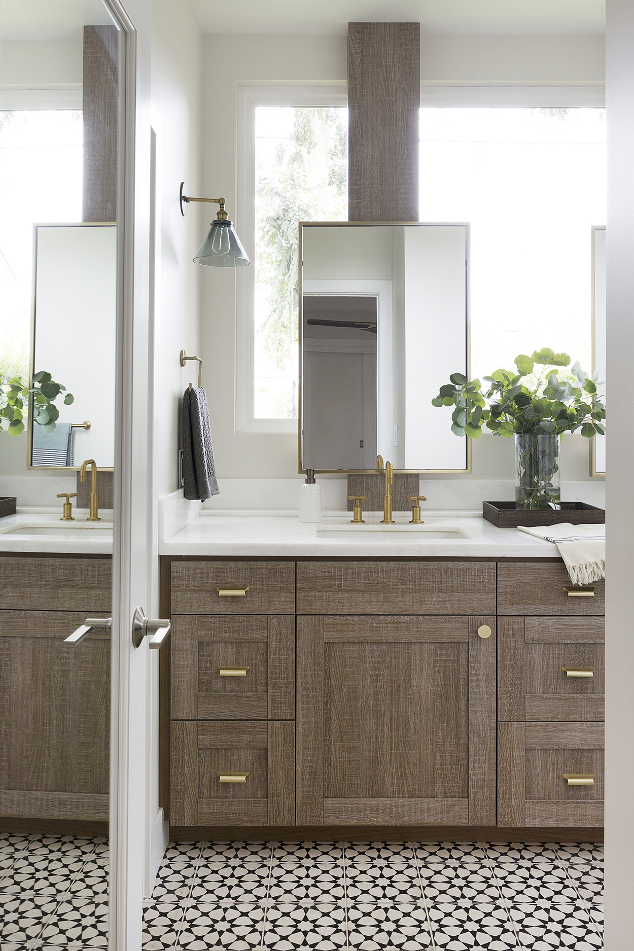
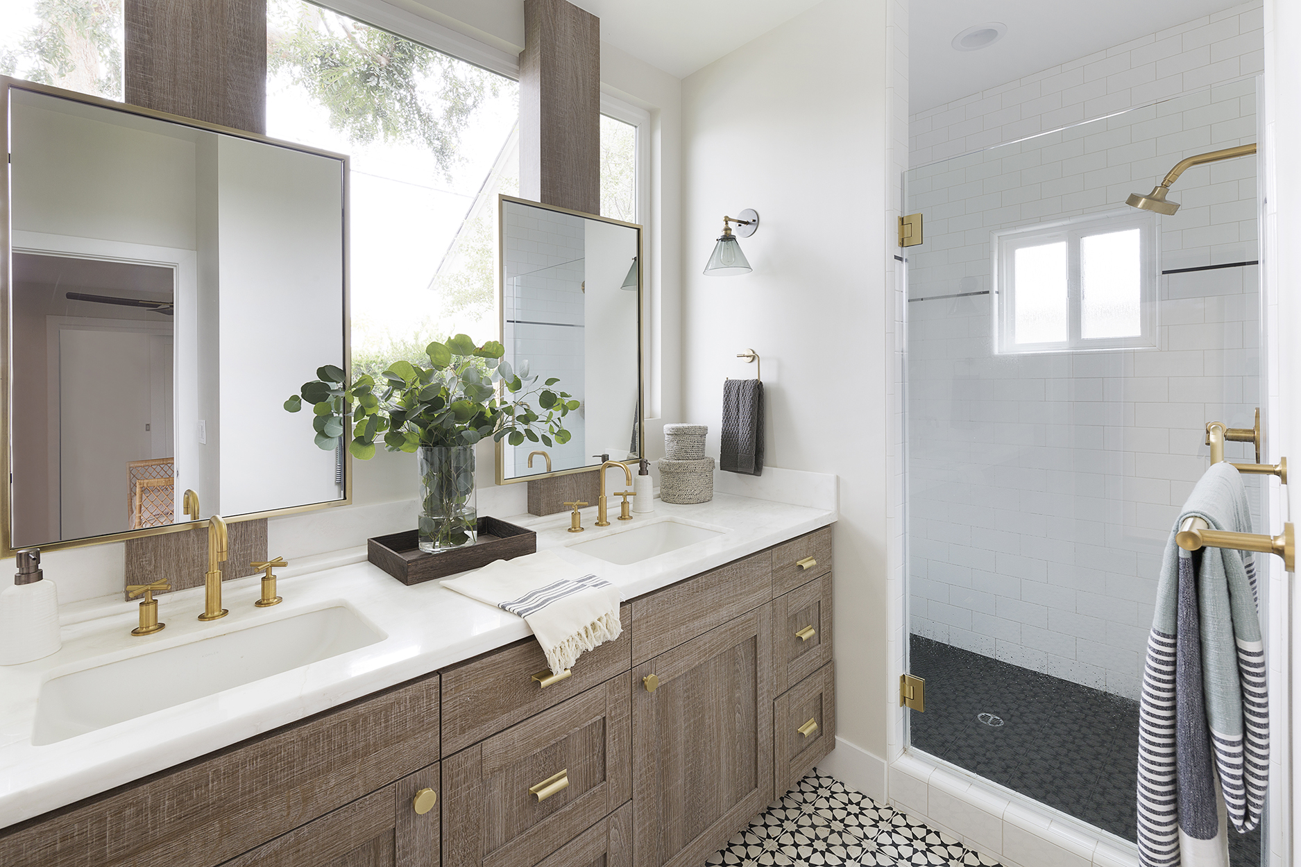
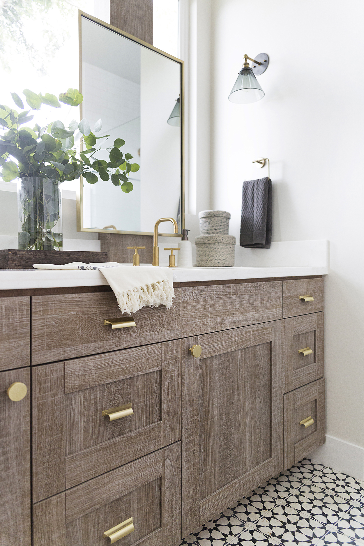
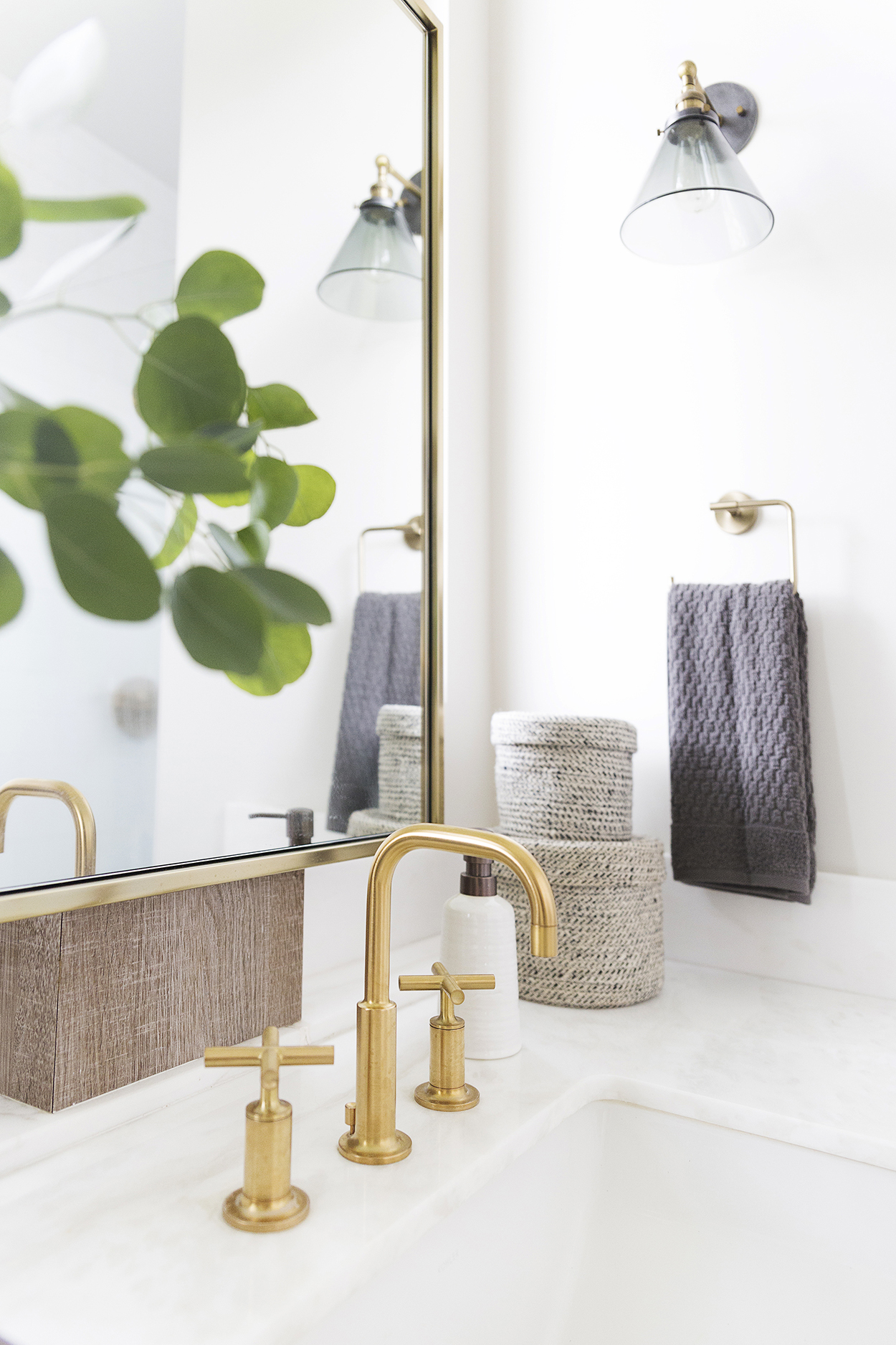
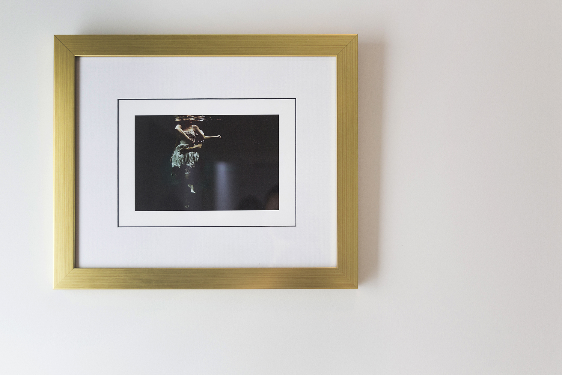
Funny story about that headboard btw. We got it with our merchandise credit that Pottery Barn gave us for a defective patio set we had purchased from them a few years prior. We took great care of the patio set and kept it covered half the year, and even treated it with special teak oil before covering it up for the season. It started peeling and falling apart less than 2 years later, and Pottery Barn actually gave us a full refund in the form of product credit. So I bought a headboard and new dishes and we still need a patio set. I guess this story isn’t all that funny, just wanted to mention that PB generally stands by their product, so call and complain if something doesn’t hold up. I bought this off Society 6 years ago and I can’t for the life of me remember the artists name and I wish I did because they had a whole series of these underwater photos, and I’d like to purchase more. It’s not signed or marked or anything, and it’s been so long Society 6 no longer has my order history. If you happen to know how this is, please let me know! My friend Shelly of VanRozeboom Interiors helped design the bathroom and I love it. The large window inspiration originally came from a home I had seen in Sunset magazine, and I loved the idea of all that natural light pouring in everyday. We didn’t plan thoroughly enough before hand and should have had a pull down shade installed first, before the beams were installed, but so far 2+ years later, we haven’t had any peeping tom mishaps. Because the window overlooks the backyard, we just can’t take a shower when having a backyard BBQ, but that would be weird to be showering when you have guests anyhow. The tile is rad, but a word of warning, it does get very weathered over time. You need to be fastidious about sealing it, but even then, I’ve read it’s pretty much impossible to keep stains off it. If you are really OCD about markings on your floor, this is not the tile for you. But if you don’t mind a little weathering and think it gives it character, go for it. The tile definitely cleans up nicely and easily, it just gets stained very easily. In fact by the door there’s a couple of teeny tiny pencil markings the tile guys left behind that won’t come off, and I stare at them every time I go to the bathroom. It doesn’t bother me all that much but it would a neat freak, which certainly isn’t me 😉 The small toilet area, not pictured, has a pocket door on the opposite wall of the shower, which allows for privacy. It also has a door that opens up to the outside, and a cabinet to hold towels, so it functions as a pool bath. Our architect questioned our decision to have our master bath also be the pool bath, but again, 2 years and multiple pool parties later, it hasn’t at all been an issue and I’d much rather kids use this bath than traipse through the house in wet feet, to get to the other bathroom. The cabinets are actually a veneer and I get asked all the time what stain it is we used to get such a weathered look that looks somewhat clean as well and I think people are disappointed to learn that this is all veneer! We love them though and it saved ourselves a lot of money, otherwise we would have had to pay a pretty penny for stain-grade custom cabinetry like this. The faucets are Kohler Purist line, and all the towel bars and other accessories are from Delta. The Purist accessories that went along with the line were outrageously expensive and I actually quite like that the Delta accessories are more of a bronze finish than gold, and don’t match exactly. The mirrors are from West Elm and knobs are from Schoolhouse Electric. So you’re just gonna see this side of Taylor’s room, because the other side of the room looks like a typical tween’s room; cluttered and messy and just full of stuff. She has a desk, a bookcase and bean bag chair, and just tons of tchotchkes and *stuff*. It is what it is. 🙂
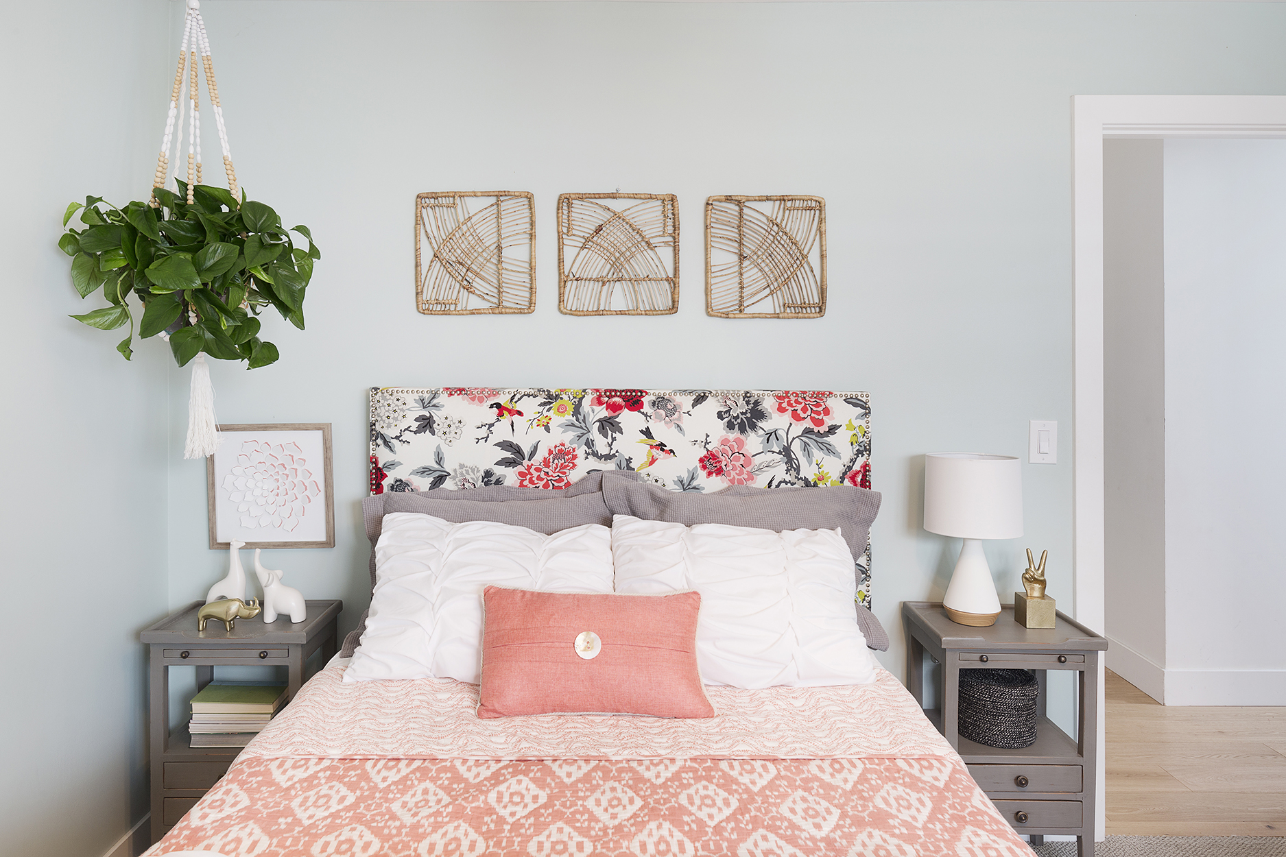
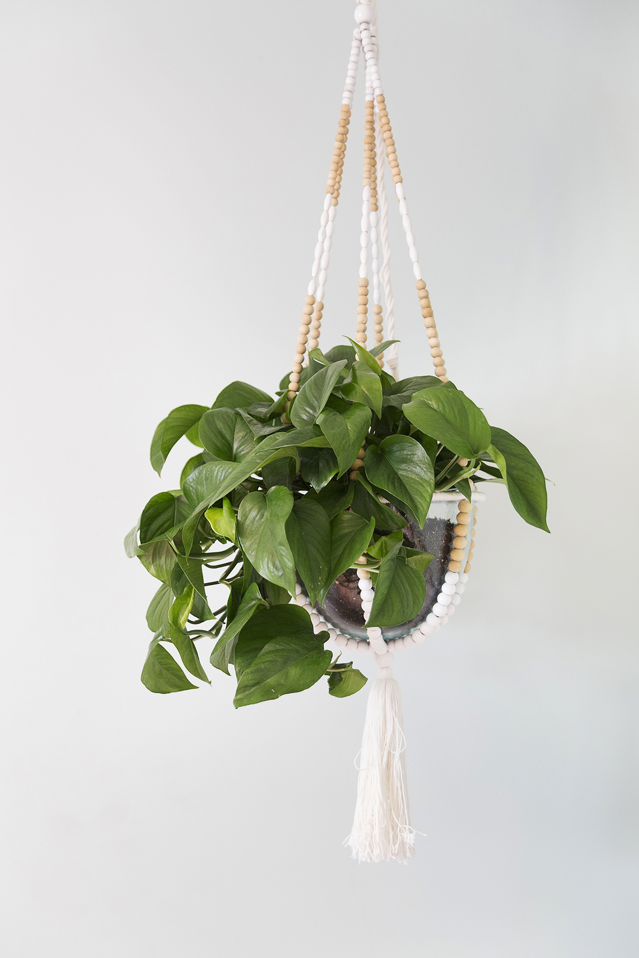
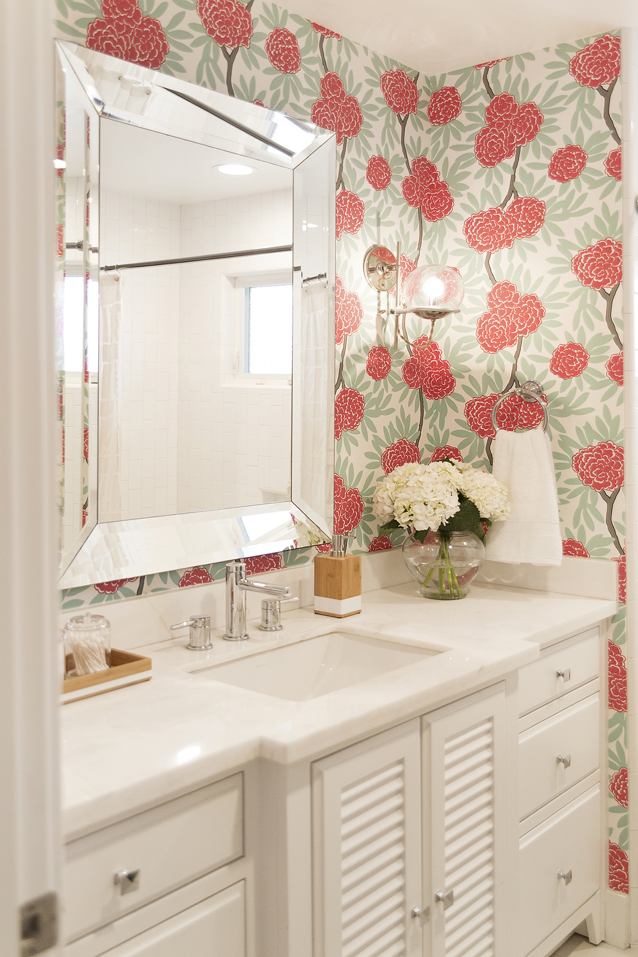
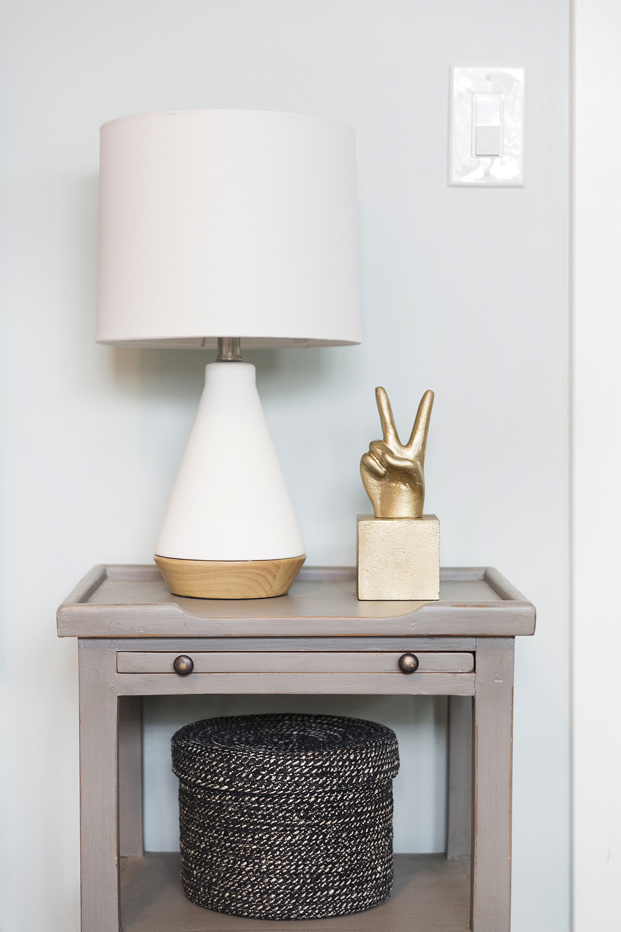
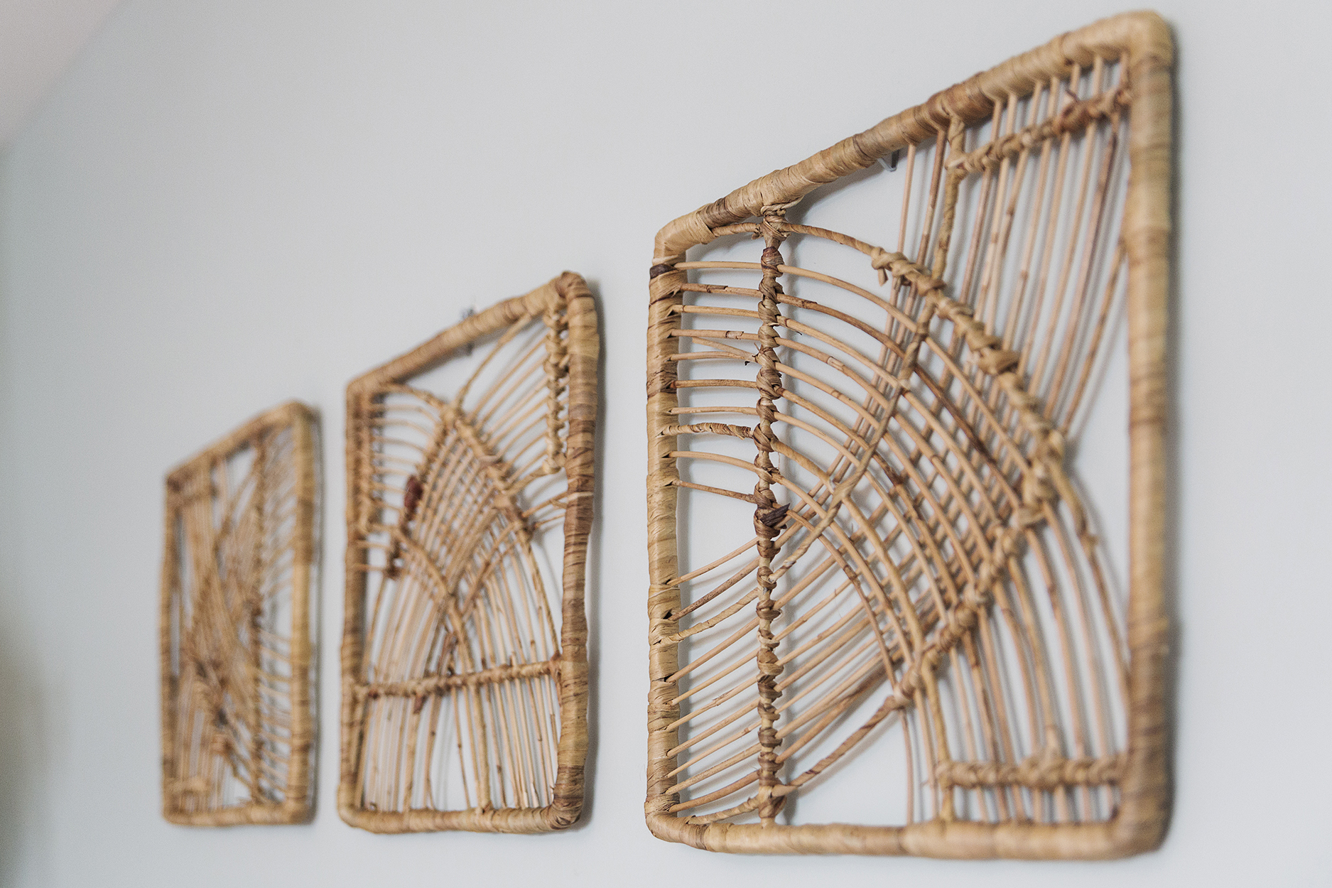
The headboard and all the little accessories you see, including those cute raffia hangings, lamp and animals are from Target. The bedding is also a mix of Target and Annie Selke. The nightstand are from Chartreuse. This cute plant hanger is from PB Teen and I don’t think they carry it anymore, but we love it and wish I had one for my office too. I’m really digging hanging plants and love that they’ve made a resurgence in recent years. Bring back the macrame plant hangers! They will always remind me of my childhood and grandma. So Taylor’s bathroom, which also serves as the guest bath because it’s in the hallway, is the only room I have a couple of regrets on. We chose a off white/light gray 10″ hexagon tile with off white grout, but we made the grout lines too large, and so the floor always looks dirty. So dirty that the photographer didn’t even photograph it, which is a shame because the tile itself is really cool. Oh well. We are contemplating either digging out the grout and regrouting with darker grout, or seeing what it takes to paint it. It drives me crazy. But in a whole house, if that’s the only mistake we made, I count it as a pretty big victory. There could be worse things to fret about, that’s for sure.And so that’s our house! When the office and boys room is complete, I’ll share those pictures, and then maybe if I have the energy to look through all my old photos, I’ll share some before and afters, because the house did experience quite the transformation! And then I’ll be done talking about our house 😉 I don’t know how design bloggers do it, talking it about houses all day haha!
Here are sourcing links if you’re interested:
Master Bed & Bath:
Faucets & Shower Valve: Purist by Kohler
Tile: Cement Tile Shop on floor & Ann Sacks in shower
Mirrors: West Elm
Lighting: Restoration Hardware
Cabinet Hardware: Schoolhouse Electric
Accessories (wood tray, marble holders & round boxes): Container Store
Headboard & Task Lights: Pottery Barn
Bedding: Annie Selke via Chartreuse Home Furnishings
Nightstands: Chartreuse Home Furnishings
Taylor’s Room & Bath:
Bedding: Target & Annie Selke via Charteuse
Nightstands: Chartreuse
Lamp & Accessories: Target
Raffia Wall Hangings: Target
Plant Hanger: PB Teen no longer available
Faucets & Shower Valve: Moen Align
Wallpaper: Caitlin Wilson
Tile: Ann Sacks
Lighting: Schoolhouse Electric
Cabinet Hardware: Rejuvenation
Photography by Lula Poggi
Design & Styling by VanRozeboom Interiors & Sam Tanner Interiors
Leave a Comment